Visual & Graphic design
(Graphic & Visual design work)
Chosen theme: Mental health awareness
Chosen format: Digital collage
Three creative concepts in the creative output: Constraints, Contrast, Cultural context
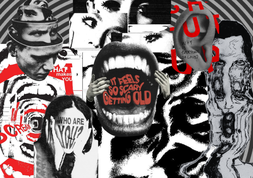
This collage uses expressive, eerie, and retro-inspired imagery to depict the intense and complex emotions faced by people struggling with mental health issues, drawing from both my own experiences and those I’ve witnessed. Through purposeful use of contrast—especially black, white, and striking red elements—I aim to evoke empathy, challenge common beliefs, and encourage a deeper understanding of these struggles. Created using digital tools like Photoshop and Canva, the project also reflects my UX design learning, where connecting emotionally with an audience is essential.
(Social media posters)
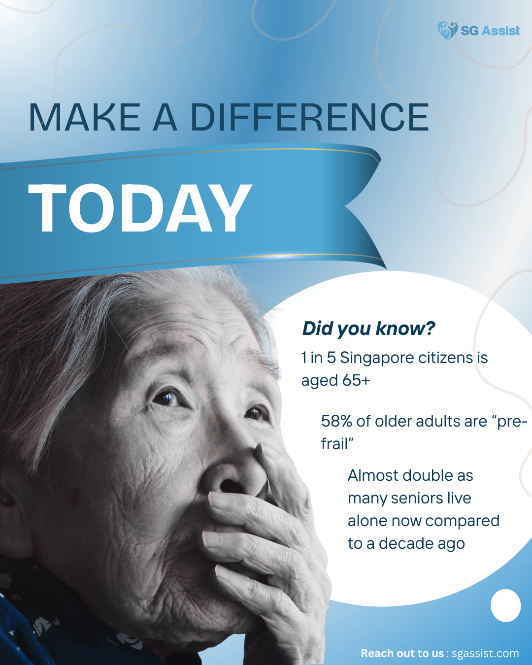
(Instagram post; SG Assist)
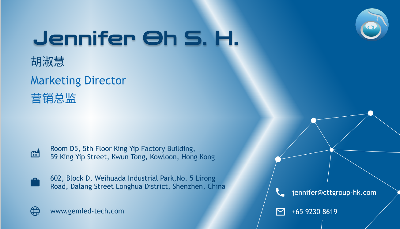
(Name card design)
This is my rendition of a name card that I have designed for a client of mine. Her company sells LED and she wanted the design of the card to look futuristic with technological elements. These designs showcases my ability to match a company's identity as well as follow client's needs.

(Promotional posts)
This is a animated promotional post via their Instagram for DOPA DOPA Creamary that was done using Adobe express. I also redesigned their website, it's under the "Website redesigns" section. This showcases my skills in terms of social media marketing and graphic design.
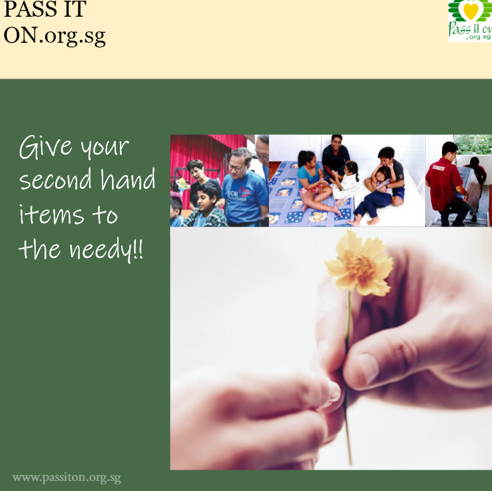
This is another promotional post that I did for another company called passiton.org.sg. It is non animated and another redesign was also done for this website that is also under the "Website redesigns" section.
(Game Redesign proposal)
This is a game redesign proposal that I did. This PDF displays the research, an in-depth analysis and final proposal. It also talks about how it caters to the specific target audiences and my inspirations for the game. This showcases my ability to analyse target users to produce a creative experience that is user centred.
Some important points of the presentation
- Formal elements & AGE framework
- Bartle player types
- Octalysis Graph
- Motivation/ engagement
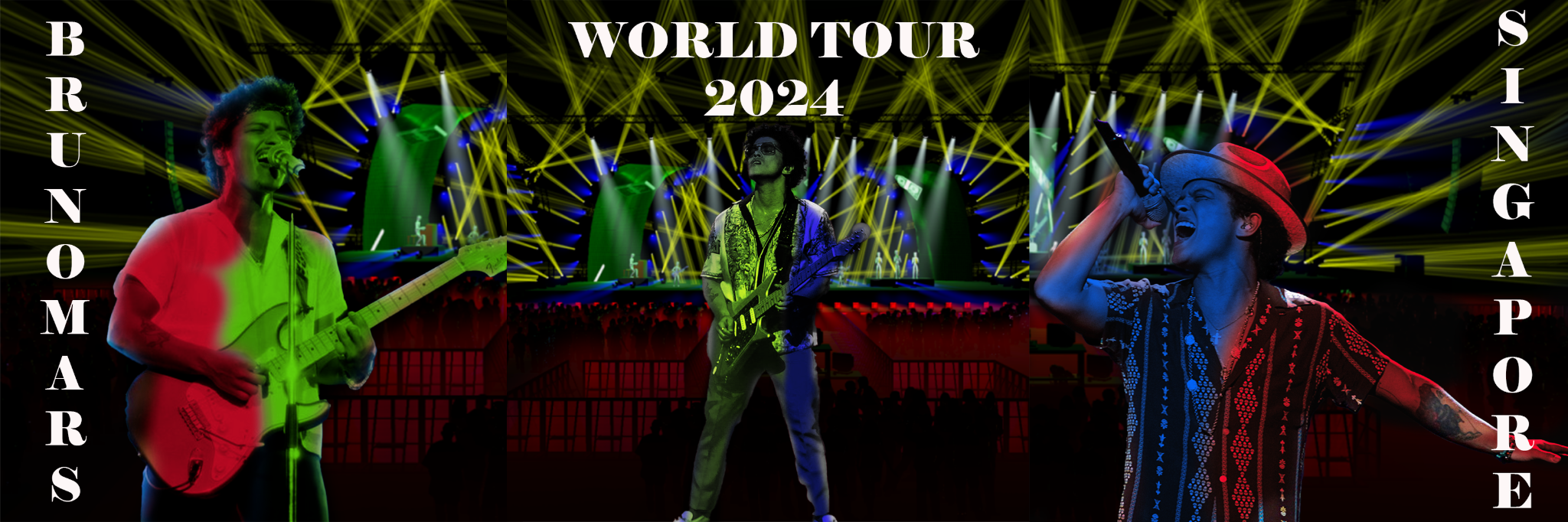
(Carousel promotional post design)
This is a carousel designed and edited by me using Photoshop. It is made up of 3 different pictures put together and it's meant to be a promotional post on Bruno Mars instagram feed for his latest world tour.
Visual elements:
- Contrast and harmony There is a certain contrast in the shiny words as compared to the rest of the poster, this makes those words stand out. There is harmony in the colors and textures of the words and Bruno mars the artist himself, making the poster look more visually appealing overall and attractive to the viewers.
- Repetition
There is a repetition and consistent color in this poster. The colors on the words and the background reflect his clothing very well. There is also consistent lighting on some of the words in Japanese, emphasising the key messages of the poster itself.
- Hierarchy
There is a good hierarchy in the words and messages surrounding him as it is big enough for the readers to see. The size of Bruno mars in the image is also not being overshadowed therefore allowing him to be seen as the main figure on the image.
Post a comment